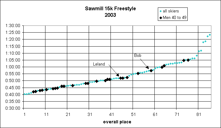
Bob's better results: Sawmill 15k
I've been on my training program for 36 weeks and it's time to begin assessing
the progress...
- The first two graphs below plot the finish time (vertical) versus finish
place (horizontal).
- The large black diamonds plot skiers in my age division; the smaller
gray diamonds display everyone else.
- The call outs indicate two skiers in particular: Bob (me) and Leland
(a fellow Lone Clone Cabin member who happens to be in my age group).
After plotting several races, I've noticed that they all seem to look similar:
most of the skiers finish at rather consistent intervals (the almost straight
part of the graph) with a few stragglers at the end (the rising tail). I'm
not sure why the plots take this form. If each skier went at his own best
pace and we had a gaussian distribution of paces, I would expect to see an
"N" shaped curve with tails at both ends. Perhaps this just shows that we
don't have any world class elite skiers in the local races. Also, a plot
of log(t) would show the "N" of a gaussian distribution better - maybe that's
a more appropriate way to graph it.
But, I digress. The point is that I was obviously in the stragglers' tail
of last year's Sawmill 15k. This year, I've moved about a third into the
straight part of the graph. What's more, instead of last in my division, I
beat 4 men and moved half way to Leland (whose finish this year is almost
identical to last year).
The absolute time isn't really important, by the way. Although I cut 30
minutes from last year, the entire field skied faster this year. Last year
we all struggled with soft, punchy, slow snow. This year, the snow was firm
and faster.
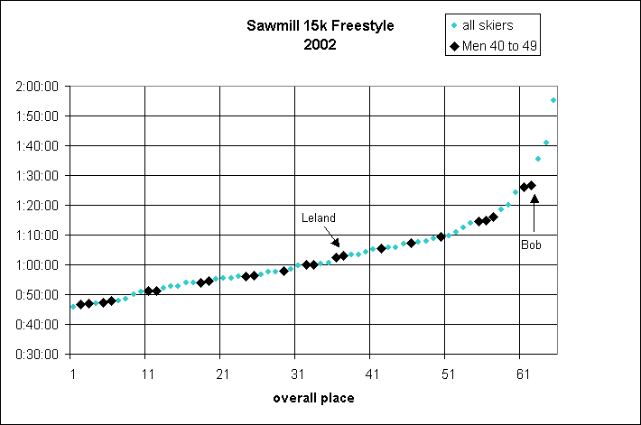
As you can see, the Senior Male 40 to 49 division is a pretty tough crowd,
finishing 10 of the top 20 overall of the 2003 race and 8 of the top 20 in
2002.
So, what have we learned?
What did I do better?
- Increase training time - from (maybe) 150 hours to 200 hours per year.
- Training focus - from general fitness to more XC ski specific.
- Improved technique. I've gotten about 30 days on snow between these
two races.
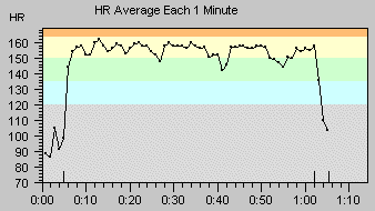
- Better pacing. Last year, I tried to jockey for a position that put
me beyond my sustainable pace. I made a more measured start this year.
- Somewhat better pre race preparation. I managed my diet and hydration
better this year.
What did I do worse?
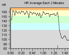
- I skied for a couple of hours at a pretty hard pace the day before.
That pre race workout significantly depleted my muscle energy. Had I rested
the day before, I could have kept my heart rate almost 5 bpm higher throughout
the race and probably finished a couple of minutes faster.
Here are the heart rate graphs:
2002
|
2003
|